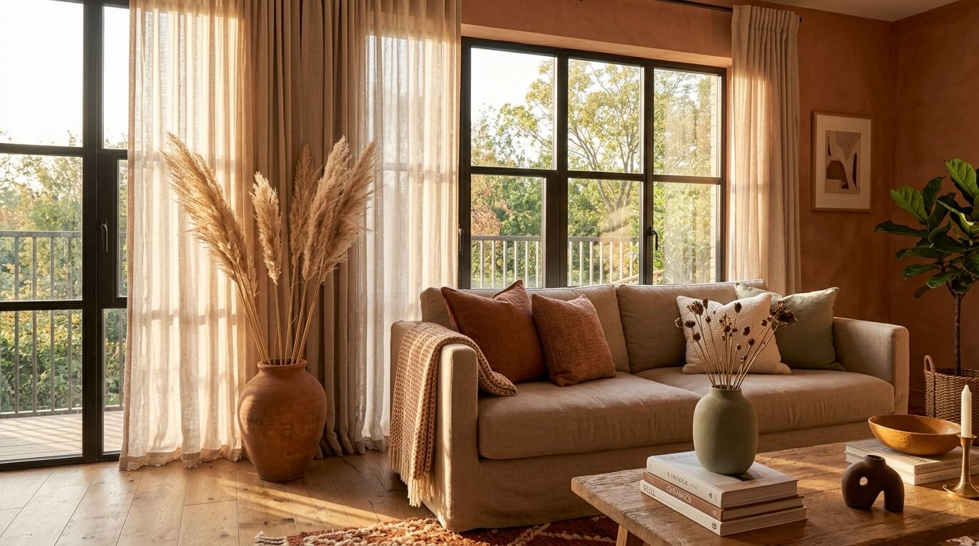

Home Color Palette: The Complete Guide to Choosing, Building & Living With Color in 2026
Your home color palette is one of the most powerful — and most permanent — decisions you’ll make when designing your space. Get it right, and every room feels intentional, cohesive, and deeply personal. Get it wrong, and no amount of beautiful furniture or minimalist wall decor will save a space that feels visually chaotic. I’ve repainted rooms more times than I’d like to admit before I really understood how color works across an entire home — and that experience has been worth every drop of paint.
A home color palette is a curated set of colors — typically three to six shades — chosen to work harmoniously throughout your entire living space. It includes a dominant base color (usually a neutral), one or two secondary tones for accent walls or furnishings, and one or two bold accent shades for accessories and details. A well-chosen palette creates visual flow from room to room while giving each space its own distinct character.
Whether you’re starting from scratch in a new build, refreshing a single room, or finally tackling that whole-home renovation you’ve been dreaming about, this guide walks you through every step. From understanding the color wheel to using a home color palette generator, selecting an earth tone color palette or going crisp and clean with a neutral color palette — this is everything you need to make confident, lasting color choices in 2026.
What Is a Home Color Palette and Why Does It Matter?
Think of your home color palette as the visual grammar of your house. Just as language needs consistent rules to make sense, a home needs consistent color logic to feel cohesive. Without it, you end up with a turquoise kitchen, an orange bedroom, and a grey living room that look like they belong to three different people. With it, even a modest rental apartment can feel curated and intentional.
Color psychologists and interior designers have long understood that color directly influences mood, perceived space, and even how long people linger in a room. Research in environmental psychology consistently shows that warm colors like terracotta and ochre create feelings of coziness and energy, while cool blues and greens promote calm and focus. Your palette isn’t just decorative — it’s functional.
The 60-30-10 rule is the foundation most professional designers work from. Sixty percent of a room’s color comes from a dominant tone (usually walls and large furniture), thirty percent from secondary colors (rugs, curtains, upholstery), and ten percent from accent colors (artwork, throw pillows, small accessories). Once you internalize this rule, building a color palette for home feels far less overwhelming.
The 60-30-10 rule is your foundation: 60% dominant color, 30% secondary, 10% accent. This single principle prevents the most common color mistakes homeowners make.
The Main Types of Color Palette for Home Interiors
Before you start picking paint swatches, it helps to understand the broad palette families. Each has a distinct personality and works best in specific contexts and lifestyles.
Monochromatic palettes use a single hue in varying shades and tones. A room built around dusty sage green — from pale celadon walls to deep forest green velvet chairs — achieves a sophisticated, serene look without risk. It’s one of the easiest approaches to pull off confidently.
Analogous palettes draw from colors that sit adjacent on the color wheel: think warm amber, terracotta, and burnt sienna layered together. These feel naturally harmonious because they share undertones, making them especially effective for an earth tone color palette for home that feels grounded and inviting.
Complementary palettes combine colors from opposite sides of the color wheel — navy and warm gold, forest green and rusty orange. The contrast creates visual energy, which works beautifully in living rooms and dining spaces but can feel overstimulating in bedrooms.
Neutral palettes anchor the space in whites, creams, beiges, warm greys, and greiges. A neutral color palette for home isn’t boring — it’s the canvas that lets texture, material, and form become the stars. Add warm wood tones, linen textiles, and artificial plants for home decor to bring a neutral palette to life without overwhelming it with color.
According to color theory, colors with similar undertones (both warm or both cool) always work together harmoniously — even when their hues are very different. This is why warm white and warm grey pair so naturally, while cool white and warm beige can clash unexpectedly.
How to Choose a Color Palette for Your Home
How to Choose a Color Palette for Your Home Without Feeling Overwhelmed
The single most effective starting point is to find one piece you already love — a rug, a painting, a set of cushions, even a favorite item of clothing — and pull colors from it. In my experience, this method works better than staring at paint chips in a hardware store, because you’re starting with something that already resonates emotionally. From that anchor piece, identify three to four colors: the most dominant shade becomes your wall color, the second most prominent becomes your secondary, and the smallest accent becomes your pop color.
Natural light is the factor most people overlook. A shade of white that looks warm and creamy in the store can appear greenish or purple in your north-facing living room. Always test paint swatches at home in a large patch (I recommend at least 12 inches by 12 inches) and observe them at different times of day and under artificial lighting before committing. Benjamin Moore’s White Dove (OC-17) looks completely different in a south-facing versus north-facing room — that’s how much light matters.
Also consider the fixed elements you can’t change: flooring color and material, countertop hues, existing brick or stone, and the wood tones of built-in cabinetry. These anchor your palette whether you want them to or not. A home with warm honey oak floors will fight against a cool, grey-heavy palette — so either lean into those warm undertones or commit to replacing the flooring as part of your renovation budget.
How to Pick a Color Palette for Your Home When You Have Multiple Rooms
The key is the “flow test”: stand at the entrance of your home and look straight through to as many visible spaces as possible. Every color you can see from that vantage point needs to relate to every other color. This doesn’t mean identical — it means harmonious. Open-plan homes in particular benefit from a whole home color palette that shifts in tone rather than hue from space to space. Your living room might use the palette’s lightest value, the kitchen a mid-tone, and a feature wall or dining area the deepest shade.
Paint a large poster board (at least 18″ × 24″) with your chosen color and move it around the room at different times of day before buying full gallons. This costs about $5 in sample paint and saves you from a $300 repainting mistake.
Building a Whole Home Color Palette That Flows
A whole home color palette is different from choosing colors room by room. It’s a system — a set of rules that governs how color moves through every connected space. Professional interior designers typically build this system around three to five anchor colors that can appear in different proportions depending on the room’s function and the light it receives.
Start by assigning colors to categories rather than rooms. Choose one primary neutral (your most-used wall color), one warm accent neutral (think warm taupe or linen), one deeper tonal shade for feature walls or cabinetry, and two accent colors that can appear as accessories throughout the home. With this system, you can mix and match freely because every combination you create draws from the same curated set.
Hallways and transition spaces deserve special attention in a whole home palette. These connective areas are often forgotten, but they’re the spaces where your color story either holds together or falls apart. A hallway painted in your medium-toned neutral bridges your living room and bedroom colors naturally — and prevents the jarring color-jump that makes a home feel disjointed.
| Room Type | Recommended Role in Palette | Suggested Color Family | Light Level Consideration |
|---|---|---|---|
| Living Room | Dominant / anchor color | Warm neutral, soft greige | Usually has most natural light — test both AM and PM |
| Kitchen | Secondary color or dominant neutral | Crisp whites, warm creams, sage | Overhead lighting affects undertones strongly |
| Primary Bedroom | Calm accent — deeper value of main palette | Dusty blue, warm taupe, soft clay | North-facing rooms need warmer undertones |
| Bathroom | Accent or tertiary pop of color | White base, bold tile accent | Small spaces tolerate bolder choices well |
| Hallway / Entry | Bridge color between spaces | Medium-toned neutral, greige | Often low light — avoid cool dark shades |
| Home Office | Focused secondary tone | Muted green, navy, warm grey | Layer with task lighting for accuracy |
Working With a Neutral Color Palette for Home
Neutrals have had a cultural moment over the past decade, and they show no signs of fading in 2026. But “neutral” doesn’t mean beige — it’s a much richer category than that. Today’s neutral color palette for home might include warm putty, aged linen, soft mushroom, bleached wood tones, raw plaster finishes, and the warmest off-whites. The secret is choosing neutrals that share the same undertone family.
Warm neutrals — those with yellow, red, or orange undertones — create cozy, inviting spaces that work especially well in older homes with traditional architecture. Cool neutrals — those with blue, grey, or green undertones — lean contemporary and pair beautifully with modern home decor, clean-lined furniture, and industrial elements. Mixing warm and cool neutrals in the same space is where most people go wrong. Pick a lane and commit to it.
Texture is what saves a neutral palette from feeling flat. In a room where the entire color scheme is cream, taupe, and warm white, the visual interest comes entirely from contrast in texture: rough linen against smooth ceramic, matte plaster walls beside glossy subway tile, woven baskets next to polished brass hardware. A neutral palette demands more attention to material and finish than any other color approach.
Be careful mixing warm and cool neutrals — what looks like “just white and beige” often clashes because one has a blue undertone and the other has a yellow undertone. Always compare swatches side by side in the actual room before purchasing.
Earth Tone Color Palette for Home: Warm, Grounded & Timeless
If there’s one palette trend that moved beyond trend-status into genuine design permanence, it’s earth tones. An earth tone color palette for home draws from the natural world — terracotta, ochre, warm sand, clay, burnt sienna, dusty sage, and warm brown. These are the colors of desert landscapes, forest floors, and sun-baked stone walls, and they bring an organic warmth to interiors that feels inherently restful.
The appeal of earth tones goes beyond aesthetics. There’s significant evidence from biophilic design research that humans respond positively to colors found in natural environments — we feel calmer, more grounded, and more creative in spaces that echo the outside world. An earth tone palette taps into this instinct without requiring you to live in a forest.
Building an earth tone palette that doesn’t feel muddy requires contrast. Anchor your palette with a light, airy base — warm white or pale sand — then layer in your medium earth tones through furnishings and textiles, saving the deepest terracotta or umber for accent walls, pottery, and woven accessories. Adding a muted sage or dusty olive as your “green” accent freshens the palette and prevents it from feeling too heavy. For ambient lighting in an earth-tone room, warm-toned LED lights for living room spaces make a transformative difference — cool LED light strips would completely undermine the warmth you’ve built.
Using a Home Color Palette Generator: Tools & Tips for 2026
Technology has made color selection more accessible than ever, and a good home color palette generator can save hours of guesswork. In 2026, several tools stand out for their accuracy and ease of use. Adobe Color remains the industry standard for designers, allowing you to build palettes based on color theory rules (complementary, triadic, analogous) and export them for reference. Coolors.co offers a more casual, fast-iteration approach — tap the spacebar to generate palettes and lock in colors you love while it continues cycling.
Paint brand tools have become increasingly sophisticated. Benjamin Moore’s Personal Color Viewer and Sherwin-Williams’ ColorSnap Visualizer both allow you to upload a photo of your actual room and virtually paint the walls — which is far more useful than comparing chips under store lighting. Some tools now use AI to suggest palettes based on your room’s fixed elements, furniture style, and even your stated mood preferences.
One underrated approach: use Pinterest as a de facto color palette generator. Save 20-30 room images you genuinely love, then look for the color patterns that repeat across them. You’ll almost always find three to five consistent shades appearing again and again — that’s your subconscious telling you what your home color palette should be.
When using any home color palette generator, always verify the suggested colors with physical swatches before buying. Digital screens display color in RGB (light-based) while paint is pigment-based — the same hex code can look surprisingly different on your wall than it does on screen.
Room-by-Room Color Palette Breakdown
How to Choose Color Palette for Home: Living Room Edition
The living room is the most visited space in any home and the one that sets the first impression. It’s where your whole home color palette announces itself. Choose your dominant wall color here first, then build the rest of your palette outward from this decision. In 2026, the most popular living room palettes balance one warm neutral wall with a standout sofa or area rug in the palette’s second-strongest color, and accessories — artwork, throw pillows, candles — in the accent color. Layering modern home decor elements like geometric vases, sculptural table lamps, and textured cushions in your accent color brings the palette to life without repainting.
For living rooms with limited natural light, err toward warmer tones and lighter values. A room that faces north or gets minimal afternoon sun will turn cool and shadowy, making cold-toned walls feel clinical. In that scenario, warm cream, soft terracotta, or even a very pale blush can make the space feel significantly more inviting.
Bedroom Color Palette: Calm, Restful & Personal
Bedrooms are the one space where you can be slightly more personal and less worried about resale value or guests’ preferences. Deep, saturated colors — navy, forest green, warm charcoal — work beautifully in bedrooms because the lower light levels make them feel luxurious rather than overwhelming. Conversely, very pale blush, soft lavender, and warm greige create serene retreats that feel spa-like. If you’re using patterned or decorative horse rugs for the home as a bedroom accent piece, make sure the rug’s color sits within your established palette rather than introducing a competing hue.
Bedrooms tolerate darker, richer colors better than any other room — the lower light levels during sleeping hours actually make deep, saturated walls feel enveloping and luxurious rather than heavy.
Common Color Palette Mistakes to Avoid
Choosing paint first, furniture second. This is the most expensive color mistake you can make. Always establish your largest, hardest-to-change elements first (flooring, large upholstery pieces, cabinetry) and build your palette around them. Paint is the cheapest and easiest element to change — save it for last.
Ignoring undertones. Two whites can look wildly different side by side because one has a pink undertone and the other has a yellow undertone. Learning to identify undertones — by comparing swatches against a true pure white — prevents the most common “this looks wrong and I don’t know why” confusion.
Over-relying on samples under store lighting. Paint stores use specific, often flattering lighting that makes colors look different from how they’ll appear in your home. Always take samples home and view them in your actual space, both in daylight and under your artificial lighting at night.
Using too many colors. More is rarely more with a home color palette. Three to five colors, used in different proportions across your home, creates more sophistication than eight colors each fighting for attention. When in doubt, reduce — not expand.
Forgetting the ceiling. The ceiling is the largest uninterrupted surface in any room. Painting it the same color as your walls but a shade or two lighter (or in bright white to reflect light) dramatically affects how your wall color reads. Many people forget to plan the ceiling color into their palette, and the results can make rooms feel smaller or heavier than intended.
Frequently Asked Questions About Home Color Palettes
How to choose a color palette for your home if you’re not naturally visual?
Start with inspiration images rather than abstract color theory. Save 20-30 photos of interiors that genuinely appeal to you — from design blogs, Pinterest, or magazines — and look for the colors that consistently appear across them. You’ll almost always find a pattern of three to five recurring shades. Those are your instinctive color preferences, and they form the foundation of your palette. From there, test large painted swatches in your actual space rather than committing from small chips — light conditions in your home are unique and will affect how every shade looks on your walls.
Another reliable shortcut is to start with a patterned anchor piece you already own and love, such as a rug, artwork, or set of cushions. Pull the colors directly from that piece — the largest color becomes your wall, the medium color becomes your secondary, and the smallest becomes your accent. This method is foolproof because the designer of that piece has already done the color-harmony work for you.
What is the best neutral color palette for home interiors in 2026?
The most popular and enduring neutral color palette for home in 2026 leans warm rather than cool — think aged linen, warm putty, raw plaster tones, and soft mushroom grey rather than stark cool greys and blue-whites. Warm neutrals are more forgiving with natural wood tones, organic textiles, and the mix of old and new that defines contemporary interiors. Sherwin-Williams Accessible Beige (SW 7036) and Benjamin Moore Pale Oak (OC-20) remain two of the most universally flattering warm neutrals for a reason — they read as rich and creamy rather than flat or institutional.
The key to making a neutral palette feel interesting rather than bland is layering texture. In a neutral scheme, visual contrast comes entirely from the interplay of matte and shiny surfaces, rough and smooth textiles, and heavy and light materials. A neutral room with linen curtains, a wool rug, smooth plaster walls, and brass hardware reads as sophisticated and intentional — the same room in plastic and polyester feels lifeless even with identical colors.
How many colors should be in a whole home color palette?
A whole home color palette works best with three to five distinct colors — typically one dominant neutral (60% of the visual weight), one or two secondary colors (together making up about 30%), and one to two accent colors (the remaining 10%). More than five colors starts to feel scattered and visually fatiguing, especially in open-plan spaces where multiple rooms are visible simultaneously. The same palette can feel dramatically different in different rooms by simply shifting which color takes the dominant role — your living room might feature more of the neutral while your bedroom features more of the secondary.
What matters as much as the number of colors is consistency of undertone. Choose colors that all share the same warm or cool bias, and your palette will feel cohesive even across very different hues. A warm terracotta, warm sage green, and warm cream can work beautifully together precisely because they all have warm undertones — mix cool grey in alongside them and the whole palette starts to feel disjointed.
Is an earth tone color palette for home going out of style?
Earth tones are not a trend — they are a design constant, and they’re showing no signs of fading in 2026. Colors like terracotta, ochre, warm sienna, dusty sage, and raw clay have appeared in human dwellings for thousands of years precisely because they’re derived from materials found in nature. Our visual and psychological systems are calibrated to respond positively to them. While specific shades within the earth tone family cycle through popularity (terracotta had a major mainstream moment around 2020-2022, while warmer camel tones and dusty pinks are prominent now), the palette category itself is evergreen.
If you’re worried about longevity, the safest approach is to apply your earth tones through furnishings and accessories rather than permanent paint or tile — cushions, throws, pottery, and artwork can be swapped as specific shades evolve, while the warm neutral walls you’ve chosen will remain relevant regardless.
Can a home color palette generator replace professional color consultation?
A home color palette generator is an excellent starting point and a powerful brainstorming tool, but it cannot fully replace professional consultation for complex situations. Tools like Adobe Color, Coolors, or paint brand apps don’t account for the specific quality of light in your room, the exact undertones of your fixed elements like flooring and countertops, or the way your eye perceives colors when surrounded by your existing furniture. For most homeowners doing a standard room refresh, a good generator combined with physical swatches is entirely sufficient. For whole-home renovations, unusual architecture, or spaces with challenging light conditions, even a single two-hour consultation with a color specialist (typically $150-$400) can save you thousands in repainting costs.
The most effective workflow in 2026 combines both approaches: use digital tools to generate and explore palettes quickly, shortlist your top three options, then purchase sample pots of each shortlisted color to test on your actual walls before making a final decision.
How do I create a color palette for home with open-plan living spaces?
Open-plan homes require more discipline with color than compartmentalized floor plans, because multiple spaces are visible simultaneously and competing colors have nowhere to hide. The most effective strategy is to use one dominant paint color throughout the entire open-plan zone — living, dining, and kitchen all on the same neutral wall color — and differentiate the spaces through furniture, rugs, and soft furnishings in your secondary and accent colors. This creates visual separation without the jarring color breaks that make open-plan spaces feel smaller and more chaotic.
If you want to introduce a second wall color in an open-plan space, limit it to a single feature wall that’s perpendicular to — not directly facing — your main sightline from the entrance. This creates a sense of depth and interest without the visual clash of two different wall colors meeting in the peripheral vision. Your whole home color palette should always be tested as a complete system before any walls are painted — lay paint swatches, fabric samples, and material samples all together on the floor of your open-plan space to see how they interact in that specific light.
What colors make a small home feel bigger?
Light, cool-to-neutral wall colors consistently make rooms feel larger by reflecting more light and minimizing the visual boundary of the walls — soft whites, pale greys, and very light greiges are the most effective. Painting walls, ceiling, and trim in the same or similar color eliminates the visual breaks that define the room’s edges, creating a more expansive impression. This technique, sometimes called “color drenching,” works especially well in small bedrooms and bathrooms where even a few extra perceived inches of space make a significant difference.
Strategic use of mirrors and lighting amplifies the effect of a light palette considerably. A pale wall bounces twice as much light when placed opposite a large mirror, and warm-toned LED lighting makes light walls glow rather than looking stark. Avoid dark accent walls in genuinely small rooms — while they can create drama in larger spaces, in small rooms they tend to close the space in and make it feel more confined.
How do I incorporate bold colors without overwhelming my home?
The safest way to use bold color is to confine it to the ten percent “accent” role in the 60-30-10 rule — meaning it appears in small doses through accessories, artwork, single cushions, and tabletop objects rather than on large surface areas. A deeply saturated jewel tone like cobalt blue or emerald green has enormous visual impact at this scale without risk of overwhelming the room. If you want a bolder move, consider painting the interior of built-in shelving, a recessed alcove, or the back panel of a bookcase in your bold color — the color appears as a backdrop rather than a dominant wall, giving you the drama without the commitment.
Another reliable technique is to use your bold color in one continuous application rather than scattered throughout. A single deeply colored armchair in an otherwise neutral room makes a confident design statement; the same amount of bold color distributed across five cushions feels restless and busy. Committing to one bold moment per room and keeping everything else quiet around it is the mark of genuinely sophisticated color use.
More Questions Answered
How to choose color palette for home when you’re renting?
Focus on removable color: rugs, curtains, throw pillows, artwork, and temporary peel-and-stick wallpaper panels. These accessories alone can transform the perceived palette of a white rental apartment without touching the walls.
How to pick a color palette for your home on a tight budget?
Limit your palette to one painted wall or single accent area and invest the rest of your budget in textiles and accessories that carry your chosen colors. A single well-placed feature wall in your accent color costs roughly one gallon of paint ($40-$70) and creates dramatic impact.
How to choose a color palette for your home’s exterior?
Exterior palettes work on the same 60-30-10 rule: body color (60%), trim color (30%), and front door/accent (10%). Always sample exterior paints on the actual facade and observe them in direct sunlight, as natural light reads outdoor paint very differently than indoor lighting does.
Conclusion: Your Home Color Palette Is a Living Decision
Choosing a home color palette isn’t a one-time task you complete and never revisit — it’s an evolving creative conversation with your space. The best homes I’ve visited have palettes that have been refined over years: a wall repainted, an accent color introduced through new cushions, a rug swapped out to shift the energy of a room. Start with a solid foundation — a carefully chosen neutral, two complementary secondary tones, and a single confident accent — and give yourself permission to adjust as you live with it.
The most important step is simply to begin. Pull your inspiration images, identify your recurring colors, buy a few sample pots, and paint some test swatches on your walls this weekend. Nothing clarifies a color decision faster than seeing it in your actual space, surrounded by your actual furniture and light. All the planning tools, palette generators, and design theory in the world are secondary to that simple, lived experience of standing in your own room and deciding what feels right.
If you’re building out your space beyond color, there’s plenty more to explore. The right modern home decor pieces can carry and amplify your palette beautifully, while thoughtful textile choices — including horse rugs for the home cheap options that bring pattern and warmth — add the layered depth that makes a color-planned home feel truly complete. Color is the starting point — what you do with it from there is entirely your own.