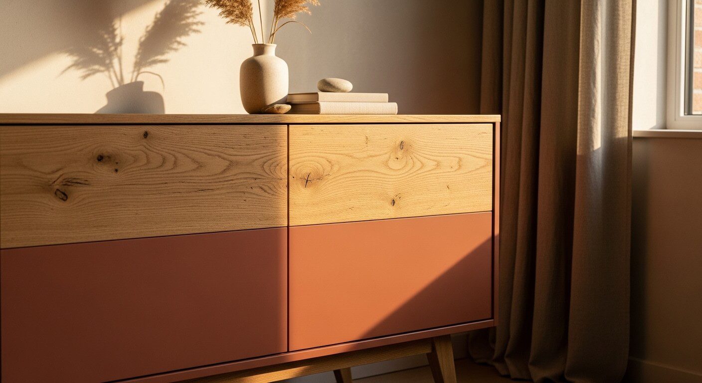

Pairing Natural Wood with Earthy Tones for a Modern Makeover
There is something quietly magnetic about a piece of furniture that refuses to be just one thing. Two-tone furniture ideas have surged to the forefront of interior design precisely because they capture that tension between rawness and refinement — between the warmth of natural grain and the grounded calm of earthy paint. When you pair wood and paint furniture together thoughtfully, the result feels both timeless and deeply personal. It is the kind of modern furniture makeover that stops people mid-step and makes them ask: where did you get that?
The appeal runs deeper than aesthetics alone. Natural wood carries with it a visual story — knots, grain lines, the memory of something living — while earthy tones in paint bring stillness and intention. Together, they create a dialogue on the surface of a cabinet, dresser, or dining table that no single-finish piece can replicate. Designers have long understood this, but the beauty of the two-tone trend is that it has finally become genuinely accessible to the everyday home decorator willing to pick up a brush and experiment.
In this article, we explore the most compelling combinations, the design principles that make them work, the pitfalls to sidestep, and the practical matters of keeping your pieces looking fresh for years. Whether you are eyeing a thrifted sideboard or a tired IKEA console, understanding how to pair natural wood with earthy paint is the single skill that will transform your approach to furniture styling forever.
Why Two-Tone Furniture Is Dominating Interior Trends
Walk through any popular home decor feed today and the pattern becomes unmistakable. Pieces that blend an exposed wood top with a painted base — or a lacquered body with a raw wood face — are everywhere, and for good reason. Architectural Digest has repeatedly highlighted the two-tone approach as one of the defining looks of the decade, noting that it bridges the gap between rustic warmth and contemporary restraint better than almost any other technique.
Part of the appeal is rooted in furniture flipping trends that emerged from a broader shift in consumer values. People no longer want uniform showroom sets. They want character, provenance, and pieces that tell a story of thoughtful curation. A two-tone finish achieves this immediately — it suggests the hand of a person rather than the output of a factory.
There is also a practical dimension. Many older pieces of furniture have solid, durable bones but dated or worn surfaces. The two-tone approach allows you to preserve the structural integrity and organic beauty of natural wood — particularly on horizontal surfaces like tabletops and drawer faces — while using paint to refresh, modernize, or visually ground the rest of the piece. It is restoration and reinvention in a single stroke.
Pinterest search data consistently shows that searches for “two-tone furniture” and “painted wood furniture” spike every January and September — exactly when people are redesigning their interiors after the holidays or the summer season. The trend shows no signs of slowing down.
What makes the current wave of two-tone furniture particularly exciting is the shift toward neutral furniture palettes anchored by nature. Rather than high-contrast pops of color, the conversation has moved toward layered earthy tones — warm taupes, dusty terracottas, sage greens, and deep mushroom browns — that feel like a natural extension of the wood itself rather than a counterpoint to it.
The Best Wood and Paint Combinations
Not every wood species plays equally well with every paint color, and understanding these natural affinities is the foundation of a successful two-tone piece. In my experience, the key is to let the undertones of the wood guide your paint choice rather than fighting them.
Light Woods: Oak, Ash, and Maple
Light woods with cool or neutral undertones — like white oak, ash, and hard maple — are extraordinarily versatile partners for earthy paint. Their pale grain reads almost luminous against darker painted sections, creating a contrast that feels airy rather than heavy. These woods pair beautifully with: Warm greige and stone tones (think Benjamin Moore’s “Stone Hearth” or Farrow & Ball’s “Elephant’s Breath”), muted sage and eucalyptus greens, and deep charcoal with warm undertones that prevent the pairing from feeling cold. The result is a neutral furniture palette that feels grounded without being somber.
Medium Woods: Walnut, Cherry, and Teak
Medium-toned woods carry a richness that already leans earthy, which means the paint needs to complement rather than compete. One thing I have learned through many furniture flipping projects is that going too light with the paint on a walnut piece can make it feel unbalanced — almost like the wood is floating. Instead, try: Warm terracotta and rust tones that echo the reddish depth of cherry, deep olive and forest greens against walnut’s chocolate notes, and cream or raw linen on base sections to create a lifted, gallery-style contrast. These combinations honor the wood’s natural beauty while giving it contemporary structure.
Dark and Reclaimed Woods
Dark woods and reclaimed timber with visible character marks are the most dramatic partners for earthy paint. Here, less is truly more — a small section of painted surface against a dominant dark grain creates maximum visual impact. Matte black with warm undertones, deep navy that nods toward teal, and dusty mauve or blush clay all create striking results without overwhelming the piece’s natural presence.
Always test your chosen paint color on a piece of cardboard held directly against the bare wood before committing. Natural and artificial light will both affect how the pairing reads, and what looks perfect at the hardware store may feel entirely different once it lives next to your specific wood grain.
Choosing Your Earthy Palette: A Room-by-Room Guide
Selecting the right earthy paint colors for your two-tone furniture project is not just about what looks good in isolation — it is about understanding how each piece will live within its room’s existing palette, light conditions, and emotional atmosphere. The best earthy paint colors share common qualities: they contain hints of grey or brown that keep them grounded, they shift subtly in different lights, and they never feel harsh or artificial.
Living Rooms
Living rooms benefit from two-tone furniture that bridges the gap between architectural elements and soft furnishings. Here, earthy paint colors like warm clay, dusty ochre, and terracotta-tinged browns work exceptionally well on sideboards, media consoles, and accent tables. The painted section grounds the piece visually while the exposed wood top connects it to natural elements like rattan, linen, and woven textiles. If your living room gets strong afternoon light, cooler earth tones — greyish sage, olive, or smoky taupe — will prevent the piece from looking washed out.
Bedrooms
In the bedroom, two-tone furniture should feel soft and restful rather than stimulating. This makes it the ideal room for the most quietly sophisticated of the earthy paint colors — dusty rose-clay hybrids, warm putty, pale terracotta, and muted forest greens. A painted bedside table base in one of these tones with a honey-oak top creates an effect that is both intimate and polished. For dressers, consider painting only the drawer fronts in an earthy tone while leaving the case and top in natural wood — the result feels like bespoke cabinetry at a fraction of the cost.
Dining Rooms and Kitchens
Dining spaces demand durability, so the choice of finish matters as much as color. Deep mushroom brown, smoked slate, and warm charcoal are earthy paint colors that hold up visually in rooms with high traffic and mixed light sources. A dining table with a painted base — particularly in a matte or eggshell finish — and a natural wood top is perhaps the most satisfying of all two-tone furniture ideas. It reads as designed without feeling precious, and it anchors the room without dominating it. You can explore more of our guidance on CraftsnComforts.com for pairing specific paint brands with wood species in these high-use environments.
The best earthy paint colors for two-tone furniture are not neutrals in the traditional grey-beige sense — they carry a warmth drawn from the natural world. Terracotta, clay, sage, ochre, and deep olive all fall into this category, and each one responds differently to wood grain, room size, and light exposure. Sampling before committing is always time well spent.
Design Principles That Make Two-Tone Work
Good two-tone furniture does not happen by accident. There are underlying principles that separate combinations that feel intentional and cohesive from those that simply look confused. Understanding these principles will sharpen your eye and your outcomes significantly.
The 60/40 Rule
One of the most reliable frameworks for two-tone furniture is the 60/40 split — roughly sixty percent of the visual surface in one finish, forty percent in the other. This ratio creates clear dominance while still giving the secondary element enough presence to register as a deliberate design choice rather than an accident. On a console table, for example, a painted base comprising the legs and lower shelf (roughly sixty percent) with a raw wood top (forty percent) hits this proportion naturally. Avoid going beyond 70/30 in either direction unless you have a very specific reason; beyond that threshold, one element begins to look like an afterthought.
Aligning Tones, Not Just Colors
The most common failure in wood and paint furniture pairings is a tonal mismatch. A cool-toned grey paint on a warm amber pine will always feel slightly off, no matter how fashionable each element is individually. The secret is to look at the undertone of the wood — is it warm (yellow, red, orange), neutral, or cool (grey, white) — and match your paint to sit within the same tonal family. You do not have to match exactly, but you should be having a conversation rather than an argument.
Surface Logic: Which Part Gets Paint?
There is an intuitive logic to which surfaces of a piece receive paint and which remain as wood. Horizontal surfaces — tabletops, shelf faces, drawer fronts — are where hands land and where the wood’s tactile quality is most appreciated. Painted bases, legs, and case sides tend to anchor the piece visually while the natural wood surface at eye level or touch level provides warmth and authenticity. Reversing this convention (painting the top and leaving the base raw) can work deliberately for a dramatic effect, but it requires a very confident color choice to succeed.
According to research from Color Psychology and related fields of environmental psychology, earthy tones in domestic spaces measurably reduce perceived stress and increase feelings of comfort and belonging — which is part of why these neutral furniture palettes have become so dominant in contemporary design.
Cost Breakdown: Budget to Premium Makeovers
One of the most compelling arguments for the two-tone furniture approach is its extraordinary cost efficiency. The range of investment required spans from a genuinely minimal outlay to a considered mid-range spend — and even at the premium end, you are working with reclaimed or high-quality pieces that would cost multiples of the total investment if purchased finished from a boutique retailer.
| Category | 🌿 Budget ($30–$80) | ✨ Mid-Range ($80–$200) | 💎 Premium ($200–$500+) |
|---|---|---|---|
| Base Piece | Thrift store, garage sale, or Facebook Marketplace find | Quality secondhand piece or entry-level flat-pack | Solid wood vintage or antique piece |
| Paint | Sample pots + single quart of standard latex | Quart of furniture-specific chalk or mineral paint | Professional-grade furniture paint, custom color mix |
| Wood Treatment | Basic wax or water-based polyurethane | Danish oil or hardwax oil finish | Hand-rubbed oil with wax topcoat, professionally applied |
| Prep Supplies | Sandpaper, tack cloth, painter’s tape | Sanding block, deglosser, foam rollers, quality tape | Orbital sander, grain filler, premium brushes & rollers |
| Hardware | Original hardware cleaned and reused | Replaced with budget-friendly brass or black handles | Hand-forged or designer hardware as focal element |
| Estimated Total | $30–$80 all-in | $80–$200 all-in | $200–$500+ depending on piece and finishes |
The furniture flipping trends community on social platforms has consistently shown that budget-tier transformations can be every bit as visually compelling as premium ones — often more so, precisely because the constraints force more creative decision-making around color, application technique, and hardware selection.
Common Mistakes to Avoid
Even the most enthusiastic approach to two-tone furniture can go sideways when these errors creep in. Awareness is the first defense.
Skipping Surface Preparation
The single most common reason a painted two-tone finish fails — whether peeling within months or looking blotchy from day one — is inadequate surface preparation. Any glossy original finish must be scuffed with fine-grit sandpaper (180–220 grit) or treated with a liquid deglosser before new paint is applied. Skipping this step means the fresh paint has nothing to grip, and no matter how beautiful the color, the finish will not hold.
Choosing Paint That Clashes Tonally
As discussed in the design principles section, tonal mismatches are the most visually obvious errors in two-tone furniture. A stark, blue-toned white paired with a warm amber oak reads as a mistake rather than a contrast. When in doubt, pull a paint chip of your chosen color and hold it against the bare wood in the natural light of the room where the piece will live. If something feels slightly off, it probably is.
Never skip a primer coat when transitioning from a dark original finish to a lighter earthy paint. Without primer, you will need four to six coats of topcoat to achieve opacity — which not only wastes paint but creates a thick, uneven surface that chips far more readily over time. One good coat of bonding primer will cut your paint coats to two and dramatically improve adhesion.
Ignoring the Scale of the Pattern
Two-tone furniture ideas that divide the piece at an awkward visual height — say, at a point that is neither clearly the base nor the midpoint — can make the proportions of the whole piece feel wrong. Always step back several feet and consider how the dividing line reads before taping. The natural divisions of the furniture itself — where a drawer case meets a base, where legs meet apron rails — are almost always the correct places to make the transition between wood and paint.
Using the Wrong Finish for the Surface
A matte chalk paint finish on a dining table top will be destroyed within months by daily use. Conversely, a high-gloss varnish on the painted base of a bedroom dresser can look garish and out of place. Match the finish durability to the surface’s intended use, and match the sheen level to the aesthetic of the piece and room. In most cases, the painted sections of two-tone furniture benefit from a satin or eggshell finish — it photographs beautifully, cleans easily, and reads as intentional without being flashy.
Longevity & Maintenance
A well-executed two-tone furniture piece is an investment — in time, creativity, and often money — which makes the question of longevity genuinely important. The good news is that with appropriate finish choices and straightforward maintenance habits, a properly done two-tone piece will outlast most mass-produced alternatives by decades.
Protecting the Painted Sections
The painted areas of your furniture need a sealer appropriate to their location and use. For pieces in lower-traffic areas — bedroom dressers, living room sideboards, console tables — a single coat of water-based matte or satin varnish over a chalk or mineral paint base is typically sufficient. For dining tables, kitchen islands, or any surface that receives daily use and cleaning, upgrade to a hardwearing furniture topcoat rated for tabletop use. According to This Old House, water-based polyurethane offers the best combination of durability, clarity, and ease of application for most furniture projects, curing to a surface that resists scratching, water rings, and general wear far better than wax-based alternatives.
Maintaining the Natural Wood Sections
The raw or minimally finished wood areas of a two-tone piece require a different approach. If the wood has been treated with an oil finish — Danish oil, tung oil, or a hardwax oil product — plan to reapply a maintenance coat once a year, or more frequently on surfaces that receive heavy handling. Always clean with a lightly dampened cloth rather than wet cleaning, and avoid placing hot items directly on any wood or painted surface without protection.
Touch-Ups and Long-Term Care
One of the underrated advantages of the earthy paint colors used in two-tone furniture is that their matte or low-sheen finishes are forgiving of minor chips and scuffs. Keep a small amount of the original paint sealed in a glass jar for touch-ups — it will keep for up to two years if stored correctly. When touching up, apply with a small artist’s brush and feather the edges to blend rather than creating a visible patch. For the natural wood sections, a light reapplication of the original finishing oil will restore any areas that have become dry or dulled over time.
The WOOD Magazine community has extensively documented maintenance schedules for various wood species and finish combinations — a valuable resource if you want granular guidance on specific wood types used in your project.
Photograph your finished piece in good natural light before it goes into use. Store this image with notes on the paint color name, brand, and finish code. Two years from now, when you need a touch-up, you will be grateful for having the exact specifications rather than trying to color-match from memory.
Frequently Asked Questions
What are the best two-tone furniture ideas for small spaces?
In small spaces, the most effective two-tone furniture ideas lean into light and contrast. Choose a pale earthy tone — warm cream, stone, or dusty sage — for the painted sections, and let the natural wood element be the darker, visually anchoring component. This reversal of the typical convention draws the eye up and out, making pieces feel lighter and the room feel larger. Wall-mounted pieces with painted bases and floating wood shelves or tops are particularly successful in compact rooms.
Which paint finish works best for wood and paint furniture makeovers?
For most two-tone furniture projects, a satin or eggshell finish strikes the ideal balance between durability and aesthetics. It is wipeable, holds up to daily contact, and photographs without the harsh reflections that come with semi-gloss or gloss options. For pieces that see heavy use — dining tables, kitchen islands — step up to a hardwearing satin furniture topcoat or water-based polyurethane for significantly greater durability. Matte chalk paint is beautiful but requires a protective sealer to be practical in any living environment.
Do I need to strip the existing finish before applying earthy paint colors?
Full stripping is rarely necessary for two-tone furniture projects unless the existing finish is badly peeling or completely failed. Instead, clean the surface thoroughly to remove grease and wax, lightly sand with 180–220 grit sandpaper to scuff the existing finish, wipe clean with a tack cloth, and apply a bonding primer before your paint coats. This preparation method is sufficient for the vast majority of pieces and avoids the time and chemical exposure that full stripping requires.
How do I choose between earthy paint colors for my specific wood?
Start by identifying the undertone of your wood — warm (amber, red, yellow), neutral, or cool (grey, white). Then choose a paint color that sits within the same tonal family rather than working against it. Warm woods like pine, cherry, and walnut pair beautifully with terracotta, clay, deep olive, and warm taupe. Cooler or more neutral woods like white oak, ash, and painted hardwoods can take cooler earthy tones like sage, dusty slate, and greige with equal success. Always test samples on cardboard held against the bare wood in the room’s natural light before committing.
What furniture flipping trends are most popular right now?
The furniture flipping trends currently dominating social platforms center on three related aesthetics: organic modernism (natural wood paired with muted, earthy paint in minimal compositions), Japandi-influenced pieces (clean lines, wabi-sabi appreciation of wood grain, restrained earthy or near-neutral palettes), and vintage authenticity (preserving original hardware and character marks while refreshing surfaces with contemporary earthy tones). All three trends share a common thread: respect for natural materials and a rejection of the perfectly uniform, mass-produced look.
Can I apply two-tone treatment to laminate or MDF furniture?
Yes, with the right preparation. Laminate and MDF surfaces require a bonding primer specifically formulated for non-porous surfaces — standard primers will peel from slick laminate without this step. The painted sections of laminate or MDF pieces can look excellent with earthy tones, but the “wood” element will necessarily come from adding real wood elements — a solid wood top, a wood veneer panel, or real wood hardware — rather than exposing an existing natural surface. Many successful furniture flippers combine MDF carcasses with solid wood components for exactly this reason.
How do neutral furniture palettes using earthy tones affect resale value?
Furniture finished with neutral furniture palettes — particularly those using current earthy tones — consistently performs well in the secondhand market. Neutral, nature-influenced colors have broader buyer appeal than bold or trend-specific colors, and a well-executed two-tone piece with natural wood elements and quality earthy paint commands a significant premium over an untouched thrift store find. Many experienced furniture flippers report two-to-four times return on investment for pieces done with quality materials and current neutral palettes.
Is two-tone furniture appropriate for a rental property or Airbnb?
Two-tone furniture with natural wood and earthy paint is an excellent choice for rental properties. The earthy tones are broadly appealing across demographics, the natural wood elements add warmth that photographs well for listings, and the combination reads as considered and premium without alienating guests. For rental use specifically, choose finishes with higher durability ratings — satin or semi-gloss topcoats rather than matte chalk paint — and ensure all painted surfaces are properly sealed to withstand the cleaning products typically used in rental turnovers.
Bringing It All Together
Two-tone furniture, at its best, is not a trend to chase — it is a design philosophy to inhabit. The combination of natural wood and earthy paint speaks to something fundamental in how we want our homes to feel: alive, warm, grounded, and genuinely ours. Whether you are refreshing a single side table with a quart of carefully chosen paint or reimagining an entire dining room set as a coordinated two-tone collection, the principles remain the same. Respect the wood. Choose paint that converses with it rather than competing. Protect both surfaces thoughtfully. And trust that the best earthy paint colors are the ones that make you exhale when you walk into the room.
The most enduring two-tone furniture ideas are those rooted in honesty about materials — paint that reads as paint, wood that reads as wood, and a relationship between the two that feels genuinely considered. These are not pieces that need to be explained or justified. They simply work, and they keep working season after season, regardless of which direction the broader trend cycle moves. That staying power is the real reward of doing this kind of work thoughtfully.
Start with one piece you already own — the one you keep meaning to deal with but never quite do. Sand it back, hold your paint chips in the light, and take the leap. The combination of natural grain and the quiet authority of an earthy palette is waiting to surprise you.